Make the Right Impression … The First Time
A Business Card Checklist
Business cards have been around since the 15th century in one form or another. Do you use a real or virtual card to share your information? Or maybe you use one of the many forms of social media?
They used to be called visiting cards, trading cards or calling cards, now we know them as business cards. Whatever form you use, virtual or real, they all provide the same thing … a way to communicate business information about an individual or company.

It’s always best to be prepared!
Recently, we were redesigning our brand and decided to order traditional business cards. Creatively, it was a fun process. How do we create a card that works with our brand, holds the important content, but also stands out from the crowd? I have put a checklist together of things you need to remember when creating your business card:
- Content is Key – I don’t know how many times I heard this at school and rolled my eyes, but they were right … it is key! Before you start putting your business card together think of what information you want to communicate. Your name, title, company name, address, phone, fax (if you have one still), email address, url, social media links, phone numbers, cell numbers, toll-free numbers, QR code, logos and/or maybe some brief information about your specialty. I know it’s a lot of information, now you have to work a design around it.
- Keep it Clean and Professional – I am sure most of you know this but maybe I have to say it. Make sure your url, phone numbers, links etc. are professional and corporate. Yeah 1-800-im-sexy or shutupnlisten.com may be funny at the time but to a prospective client or employer it may be the FAIL button!
- Describe Your Business Clearly – I mentioned this above but I think it should be a separate point. Does your company name/title/logo or card graphic define what you do? If it doesn’t, add a brief line about what you do. There shouldn’t be any questions.
- Be the Client – Look at the card through your client’s eyes. What does the client need from you and how do they typically interact with you or your business. Is the content and design consistent with your brand identity? Does it give off the right message?
- Design it Right – Are you in the design business? If so, make it great; this is your reputation. No matter what business you are in the design is crucial. The graphic/image/logo/brand needs to come across clearly and in a professional manner. Even a minimal business card designed well looks much better than one with too much information and a graphic that has nothing to do with the brand. Think it through, take time to plan the design don’t just slap it together.
- Is it Legible? – Make sure you print it out before so you make sure that the font size is ledgable. Also keep the contact information in a clean font so that the user can read it. Sometimes the font is part of the design, but typography can be a tricky thing, so if you are trying to be creative it might be a good idea to get a few different opinions before you print. Remember content is key and so if you can’t read the content that’s a problem. And please don’t use comic sans!
- Printing Specs – Maybe you want to do a die cut card or something a little more creative, or use specialty paper. Talk to your local printing company or find an online service that provides specs, guides you through the planning process and offers proofs and quotes. The last thing you want is a stack of expensive cards that has an ugly white edge, when you wanted it to be a full bleed graphic (to the edge).
- Be Consistent – Make sure that the design aligns with your brand identity … we wouldn’t want any confusion. Brand identity takes time even Nike used to have their name beside the swoosh logo, now it isn’t necessary.
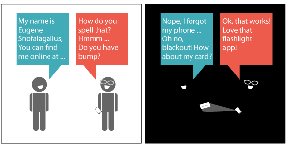
- Quality Over Quantity – With all the social media, virtual card sites, and apps to share business information, a business card is just another marketing tool. Not every client wants something virtual; many still like to have something tangible. So get quality not quantity. You may not need the amount you once did, so spend the extra money on the card stock or die cut option.
A business card is a marketing vehicle for your business or service. You have put money and time into your brand and business, put it into your business card as well … remember it’s the first impression, do it well!

